

With that being said, Pantone chose “Greenery,” a color from nature. They think we’re all ready to “immerse ourselves in the physical beauty and inherent unity of the natural world”.
Do you agree?
Not to be outdone, each paint company also makes a choice.
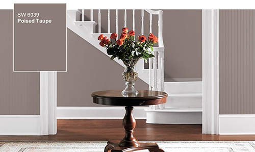
Sherwin Williams’ color is “Poised Taupe.” They anticipate that neutrals will gradually transition from grey to shades of brown and taupe.
Yes or No?
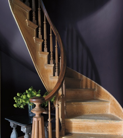
Forecasters at Benjamin Moore love the rich amethyst color they’re calling “Shadow.”
Are you brave enough to try an intense, dark color?
Pittsburg Paint is cashing in on the bohemian design trend with “Violet Verbena.” They’re calling it a “blend of masculine and feminine, mystic and modern.”
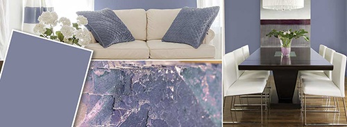
What do you think? Would you paint your living room with this cross between periwinkle and blue-grey?
I love, love the deep, saturated purple “Shadow.”
“Violet Verbena” is pretty and fresh. “Greenery” is just too dull for my taste. I still prefer shades of grey over taupe and beige.
Let me know which one you prefer?