 As an interior designer, one of the questions I get asked all the time is how to arrange items on a fireplace mantle (or a sideboard or coffee table). The problem seems to be three-fold:
- Items just don’t go together
- Objects are too small
- Or they spaced too far apart
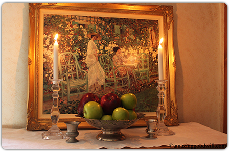
Creating a symmetrical arrangement is the easiest display. Items are perfectly balanced on each side of center.
This mantle is very formal. Start with a backdrop like this painting in a fancy, gilt frame ($9.99) and a table runner. The centerpiece is a silver-plated pedestal bowl ($4.99) filled with fresh apples.
 On each side I placed a pair of crystal candlesticks ($3.99 each) with tall tapers. Two little silver cups fill in the space. Or, you can replace the apples with a floral arrangement for an even more formal look.
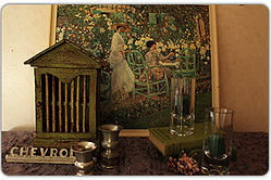
An asymmetrical arrangement is less formal. Compatible objects have a similar visual weight or shape. This arrangement is more difficult to accomplish. It takes lots of rearranging to “get it just right”.
I took the painting out of the gold frame and found an embroidered, beaded tablecloth in deep purple ($2.99 brand new!).
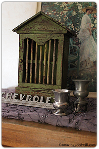 On the left, I set an old Chevy car tag in front of a painted wood shelf I already owned. Since the two silver cups are the same size, I set one on a napkin ring to give it some height.
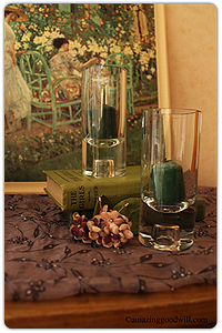 The left side is a pair of heavy candlesticks with dark green votives, books and a bunch of vintage violets.
This arrangement works for several reasons. The colors, different shades of green and purple are compatible. And the mixture of textures keeps the whole display interesting.
Send me your design questions. I’m here to help!
|
|